
A BRAND WITH SPICE
HEL’S KITCHEN
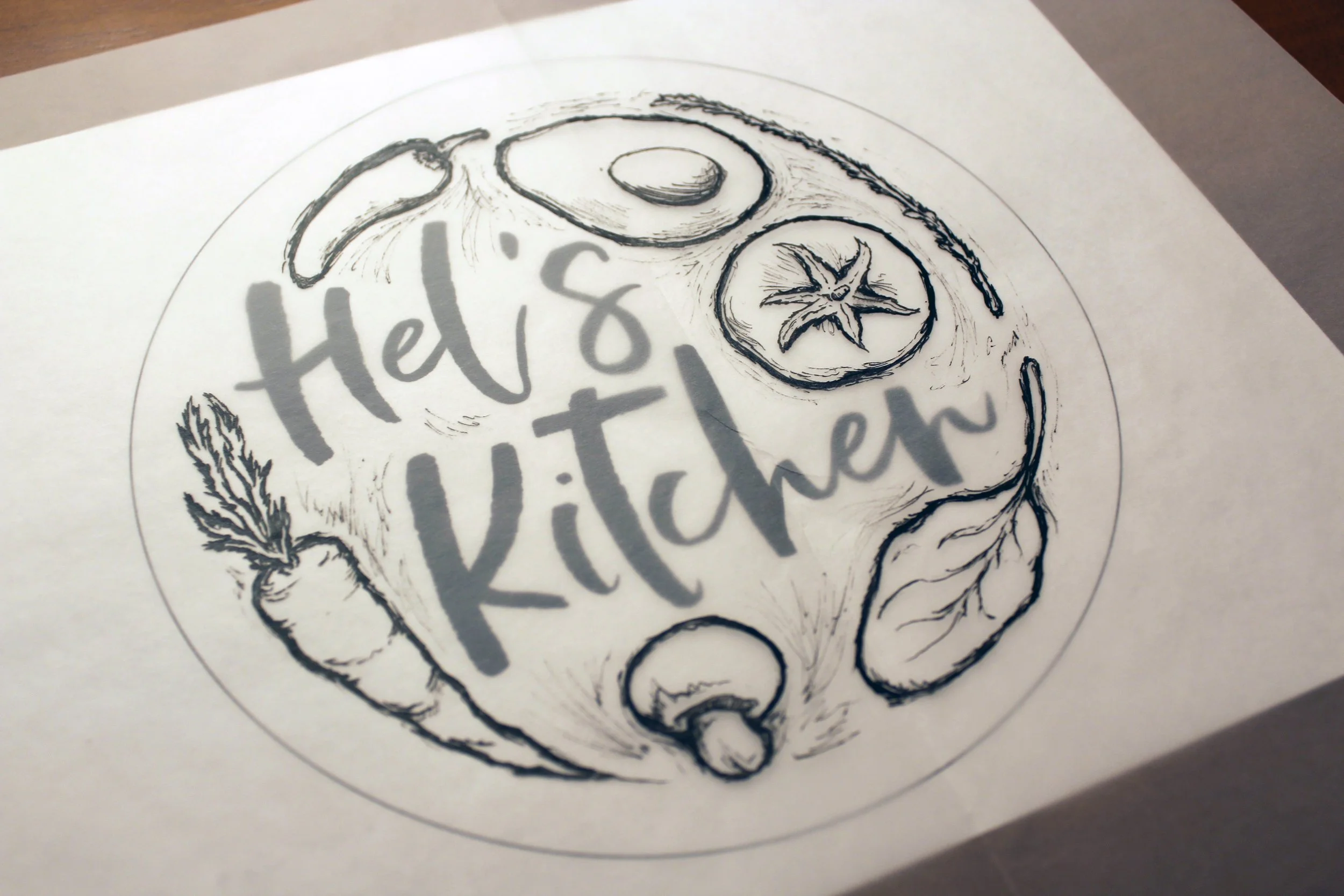
No matter how small or large a business may grow to be; a good foundation is rooted in a clear identity. Hel’s Kitchen, a meal prep and catering service in Dayton, OH, started with a delicious idea and took their first step into telling their brand story. A logo inspired by healthy eating with a bit of a sophistication captured the business model and personality they had in mind.
Assets Supplied
Logo
Business Cards

The Details
The original draft of the vegetables included some additional sketchy line work that was ultimately removed for clarity. A successful logo must work in varying degrees of size. As in the example of the business card, the logo could have easily become muddy if these smaller bits of detail were included.
The Alternates
It makes us happy when the client is satisfied. Not only did our final logo hit the mark, but they enjoyed the other options along the way. Part of our process is to provide three, very different brand marks as to narrow the results more clearly to determine the best fit for the client’s needs. In this case, the client had a difficult time choosing between two options and even contemplated applying both to different segments of their business.
Albeit kind on the client’s part, we suggested that the face of the business should begin with one entry point. Your logo identifies you with your audience, consumer, and other businesses. Working with the client, we honed in on what was important to them. The decision became easier and the final logo was chosen.
